The Dial and the Arc: Drawing an Affect State Without Lying About It
The previous piece described the state: four affect axes plus surprise, each held at three nested timescales, advancing on wall-clock time whether or not anyone is talking. It said nothing at all about how you look at it.
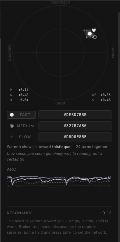
That turned out to be the harder half. The state is thirteen numbers that change continuously, and thirteen numbers in a table is not a thing anyone reads: it is a thing people glance at, and stop glancing at by the second day. What follows is one 286-pixel square, the reasoning behind each encoding, and the one place where the obvious drawing would have been a category error.
Every encoding is a claim about what a number means, and the wrong encoding makes the picture lie in a way that looks fine.
#80808080, which is the whole point of
them.What has to fit
Per turn, the appraisal model emits pleasure, arousal, dominance, affiliation and surprise. The charm network holds the first four at three timescales (momentary state, trajectory, baseline) and surprise at one, because a momentary startle has no long-run average worth the name.
So: thirteen numbers (five in the momentary state, four in the trajectory, four in the baseline) plus resonance, the derived measure of whether the moment agrees with the direction of travel. All of it live, all of it changing while you watch.
Two of those axes are directed: affiliation and dominance are held toward a particular person rather than simply held. That is not a display detail. It means the picture is incomplete unless it says whom it is about.
The plane
Pleasure runs across, arousal runs up. That much is the standard reading of a circumplex and there was no reason to be clever about it.
The one non-obvious bit is that the mark is not placed at (p, a) scaled by the
radius. It is placed along the spoke to that angle, rescaled so the square of
reachable values fills the circular face:
scale = max(|p|, |a|) / hypot(p, a)
x     = cx + p · scale · R
y     = cy − a · scale · R
Pleasure and arousal are independent, so the reachable space is a square: a character can be fully elated and fully energized at once. The dial is drawn as a disc. Scaling each axis onto the radius directly puts that corner at 1.41 times the radius, outside the ring the dial draws as its own edge, and it did: on 18% of recorded turns the mark was sitting outside the face it was supposed to be inside.
So the square is mapped onto the disc along each spoke. The direction from center is left exactly alone and only the distance is rescaled, from the Euclidean length to the larger of the two axes. Russell reads the angle as which mood this is and the radius as how strong, so this keeps the first untouched while making the second say how far your strongest axis is pushed. The rim is reached by full pleasure alone, and by full pleasure with full arousal together; no range is given up, and nothing can leave the dial. A test now asserts that last part directly.
The quadrant labels read ENERGIZED, CALM, GUARDED, WARM, so the face can be read without knowing which axis is which.
Size, and something to read it against
Dominance becomes the radius of the mark:
radius = 5 + dominance · 3 (px: 2 through 8, neutral at 5)
Never zero. A mark that vanishes at one end of an axis reads as missing data, not as low dominance, and those two need to look different.
But a size judgement with nothing to compare against is not a judgement. Alone on a face, an 8-pixel dot and a 2-pixel dot both look like "a dot". So the fast mark is drawn inside a dashed ring at exactly the neutral-dominance radius, permanently. The dot is then read against its own zero rather than against memory, and the reading becomes absolute instead of relative.
A heart that fills rather than turns
Affiliation gets a small heart set above and right of the mark, like an exponent, filled
from the bottom: fill = (affiliation + 1) / 2.
Fill, specifically, and not rotation. A small icon's angle has no baseline to be read against, and the middle of a rotation carries no meaning: a heart at 45 degrees is not "mildly warm", it is a tilted heart. Fill is a length judgement, which stays legible at icon size, and the midpoint lands exactly where it should: half full is neutral, which is what neutral affiliation is.
It fills upward from the point, so a nearly-cold heart is still recognizably a heart outline rather than a smudge in the bottom of one. The outline is stroked at every value, for the same reason the dot never reaches zero radius.
One heart, on the fast mark only. The axis has all three timescales, but three hearts on one face is clutter, and the other two are already carried by the numeric fields underneath. And because affiliation is directed, a line beside the dial names the party it is about: toward Sam. With nobody addressed, that line is empty rather than showing a warmth toward no one.
Things that happen, versus things that are
Two channels are not states at all, and are drawn as events.
Surprise is a ripple: a ring expanding from the mark over about a second, fading as it goes. Momentary by construction, so a persistent mark would misrepresent it. It happens and it is gone, which is the whole character of the quantity.
Resonance (whether the moment agrees with the trend) is carried by the trail the fast mark leaves. Coherent, the trail is solid. Below −0.3 it goes dashed. Nothing is added to the picture; something already in it changes texture, and a conversation pulling against its own direction looks broken-up rather than annotated.
Three timescales, and no hue
The three marks are separated by luminance and by shape: fast is a filled dot and the brightest thing on the face, medium an open ring in mid gray, slow a dim crosshair.
Not by color. A palette would have been easier to read at a glance and would have failed for anyone who cannot separate the hues, in grayscale, and in a screenshot run through anything. Shape survives all three. The frontend tests assert it as a property (selection is shown without relying on hue) rather than trusting anyone to remember.
Selection is the same problem twice, because the selected timescale also needs marking. Brightness alone cannot carry it: fast is already the brightest thing here, so there is no lift available. Nor a ring around the selected mark: the medium mark is a ring, and a ring drawn around a ring reads as data rather than as a pointer at data. So: four corner brackets, drawn last so they are never buried under the fast mark's glow.
The category error at the middle of it
The medium mark is the interesting one, and the obvious drawing is wrong.
The trajectory is a set of slopes: how fast each axis is moving. The obvious thing is to plot the slope vector as a point. Do that and the dial now contains two different kinds of thing in one coordinate space: fast and slow are positions in affect space, and the medium mark is a velocity. The same location means something different depending on which mark is sitting there, which is precisely the failure a shared coordinate space is supposed to prevent.
So the medium mark is the fast position advanced along the trajectory: medium = fast
+ slope · gain. That keeps all three marks honest positions: this
is where it is, this is where it is heading, this is what it is normally like.
And it has the property the slope drawing lacks. When nothing is moving, the projection collapses onto the fast dot exactly. "Not heading anywhere" looks like not heading anywhere, rather than like a mark sitting at the origin, which is a claim about neutral affect, and an entirely different sentence.
Two lines complete it: a dashed one from baseline to fast, the deviation that drives the mood description, and a solid one from fast to medium, which is the direction of travel.
The bug only a render could find
The heart rides at the mark's upper right, offset by the mark's radius. At the rim, that offset put it off the edge of the canvas. A character very warm or very energized pushes the dot to the boundary, and its heart went over the side with it.
Every structural check passed the entire time it was happening. The fix is four lines clamping the anchor inside the canvas, and it sits in the codebase with a comment saying what it is for, because the interesting part is not the arithmetic. It is that a suite asserting on values cannot see a thing leave the frame. Some bugs are only visible in a picture.
The arc
The dial is the present tense. The arc strip beneath it is the past: a 56-pixel band, four series, oldest on the left.
P    pleasure      light    solid
Af   affiliation   violet   solid
A    arousal       gray     dashed
D    dominance     dark     dotted
Color, dash pattern and a letter at the end of each line where it terminates. Direct labelling rather than a legend, so identity is never carried by color alone and the eye never has to travel to a key and back. One recessive midline marks zero; there is no other chrome, because at 56 pixels tall every added rule costs a line of data.
Hovering scrubs it, and the readout underneath gives the timestamp and all four values, signed, at that moment.
Scrubbing also pins the dial to that moment, and this is the part I like best. When the dial is pinned it stops animating: the trail and the ripples hold still. What you are looking at is not a mood the character is in; it is a mood they were in, and a mood still moving would be a lie about which tense you are reading. Typing returns you to the present, which is also asserted in a test.
What it borrows from the color picker
None of the above is a new interaction. It is a color picker.
A color picker is two things bolted together: a two-dimensional field you point at, and a hex string you can copy, paste, and mail to someone. The field is for choosing by eye when you do not know the number. The hex is for moving an exact value between places when you do. They describe the same state in two registers, and the reason the pattern has survived thirty years untouched is that the two registers cover each other's weaknesses completely.
Affect has the same shape of problem. So the dial is the field, and underneath it are three hex strings, one per Varela timescale, each editable:
●  FAST     #80808080     P  A  D  S     the moment
◉  MEDIUM   #80808080     P  A  D  Af    the four slopes
✛  SLOW     #80808080     P  A  D  Af    the baseline
             └┬┘└┬┘└┬┘└┬┘
              one byte per axis · 0x80 is exactly neutral
The glyph on each row is the mark that timescale draws on the face above (filled dot, open ring, crosshair), so the picker and the drawing name each other without a legend.
And they are inputs, not readouts. Type a hex, press Enter, and the network takes it; the dial redraws to whatever you just pasted. A malformed string is refused outright rather than coerced into something plausible: the field goes gray and nothing is set, because the one thing worse than rejecting an edit is quietly accepting a different one.
Two details are load-bearing. Neutral is anchored at 0x80 rather than falling
wherever the arithmetic lands, so the negative half gets 128 steps and the positive half 127,
and a neutral state reads as exactly zero instead of a hair off it. And the byte is computed
with floor(x + 0.5) rather than a rounding function, because Python rounds halves
to even and JavaScript rounds them up; two languages disagreeing about a half-step
would put a one-bit difference between the browser and the server on the same state. There is
a test whose only job is to assert the two codecs agree byte for byte.
What that buys is the thing the color picker has always bought: a state you can move. Copy
the fast hex off a character in a good mood and paste it onto another one. Keep a baseline in
a text file. Paste a temperament into a fresh character and it starts life as somebody rather
than at the origin. #80808080 is neutral across the board, which is also, not
quite by accident, mid-gray in the register the notation was borrowed from.
What the tests are actually about
The frontend suite is unusual in that most of it concerns legibility rather than behavior. A sample, unedited:
- no reachable state places a mark outside the dial
- the readout stays clear of the dial it sits on
- selection is shown without relying on hue
- mediumChannels sits on the fast dot when nothing is moving
- a hair below zero never shows a minus sign
- one turn is not "1 turns"
- an empty view says which emptiness it is
The last three are not about affect at all. They are about a display not saying something
faintly false: -0.00 is a claim about sign that a rounding artefact should not
get to make, 1 turns is a small wrongness that makes a reader trust the rest
less, and an empty box that does not say which emptiness it is (nothing recorded, or
everything filtered out) is a display declining to answer the only
question being asked of it.
None of that is affect modelling. It is the same rule as the claim/act quarantine in the previous piece, applied to pixels instead of prose: an interface that says something not-quite-true is worse than one that says nothing, because the person cannot tell which parts to discount.
What is not being claimed
The dial shows the scaffold's state. It is not a picture of an inner life, and nothing here asserts one; the previous piece has the full version of that disclaimer and it holds unchanged.
What it is: a readout for numbers that already exist, whose whole design brief was to not overstate them. Every encoding above is a small argument against a more impressive drawing that would have implied something the data does not support. The animation stops when nothing is moving. The projection collapses when the trend is flat. The heart sits at half when there is nobody in particular to feel warm toward.
An affect display that is inspectable is worth more than one that is persuasive, and those two goals conflict more often than I expected going in.